
We started by asking a simple question: What do officers, CFOs, directors, trustees, and advisors actually want to know when they sit down to make decisions?
Repurchase Ready produces board-ready charts at the push of a button — no report writing, no waiting on an engagement. Each one answers a question a board actually asks, and each can be regenerated the moment an assumption changes.
Below is what the output from some of our reports look like, and what each chart tells a board.
Charts show sample data for illustration.
Three strategies, side by side.
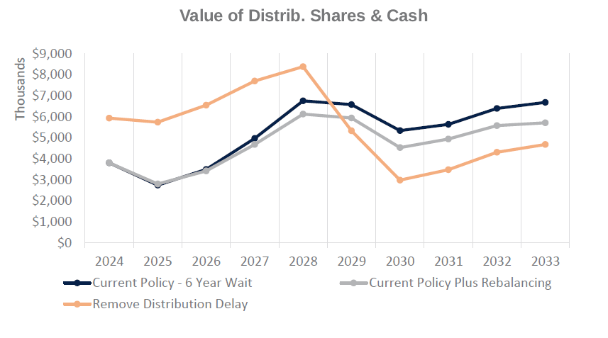
Compare projected repurchase obligation, corporate cash requirements, and benefit levels across up to three scenarios at once. Here, adding rebalancing to the current distribution policy lowers the ten-year obligation from $52.4 million to $47.5 million, while removing the distribution delay raises it to $55.1 million — with employer contributions identical in all three. The board sees what changes and what doesn’t before amending the plan.
Whether current funding covers it.
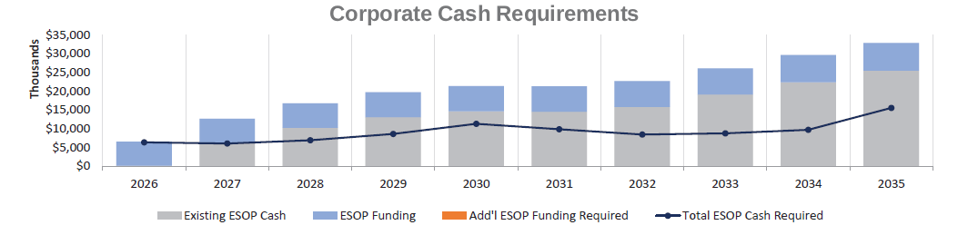
Sets the projected repurchase obligation against the cash actually available — existing ESOP cash, employer contributions, and dividends — year by year across a ten-year horizon. Where funding falls short, the additional cash required appears directly on the chart. The board learns the size of the gap while there is still time to plan for it.
What participants actually receive.
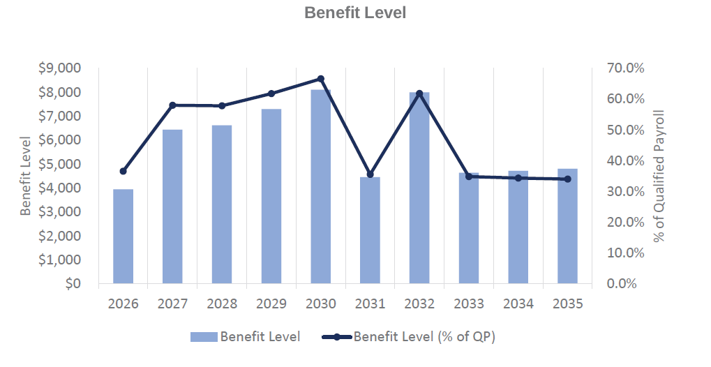
Benefit level is the value of cash and share allocations each year, shown in dollars and as a percentage of qualified payroll, including reallocated forfeitures, recycled distributions, and recontributed redemptions. Because repurchase funding and participant benefits draw on the same dollars, a strategy that smooths the obligation may also steady what participants receive — or swing it. This chart shows which.
Which years to releverage.
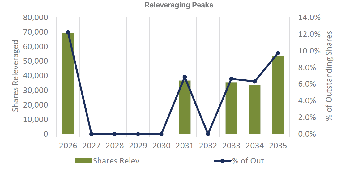
Annual share releveraging shows which plan years carry the heaviest repurchase obligation, and how many distributed shares a releveraged loan would reamortize in each. Boards use it to decide whether releveraging in peak years will hold the benefit level steady for current participants and keep shares available for newer ones.
Where share value is actually coming from.
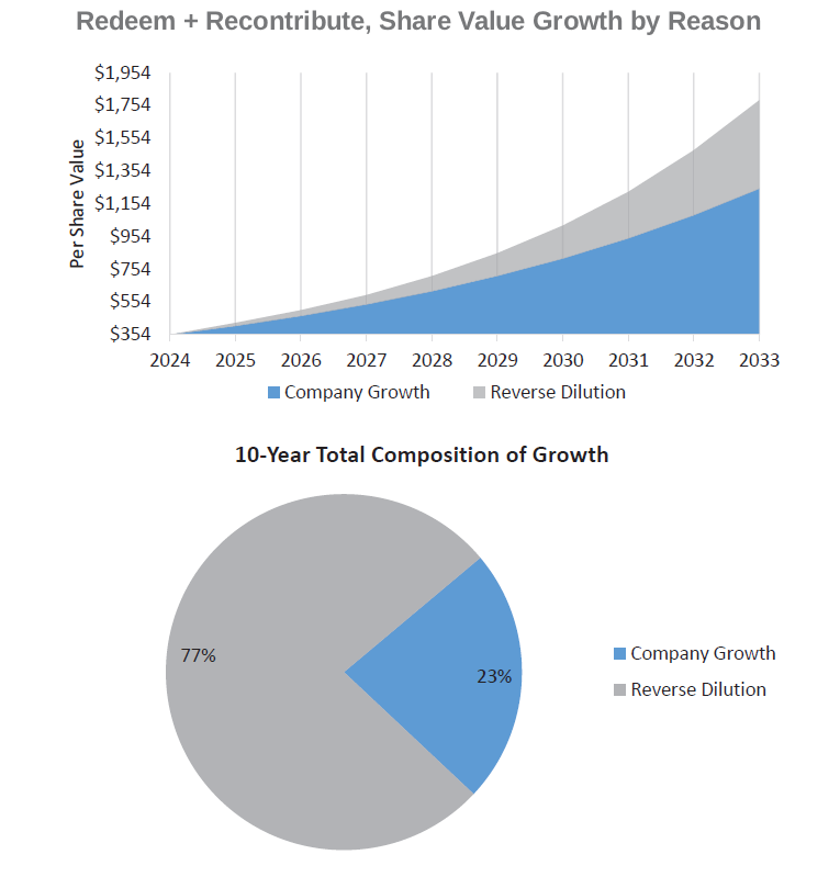
Separates projected per-share value growth into two sources: organic company growth and reverse dilution from repurchased shares. When a company redeems rather than recycles, fewer shares remain outstanding — and this chart shows the board how much of the projected value comes from that effect rather than from company performance.
The range, not a single number.
Simulations.
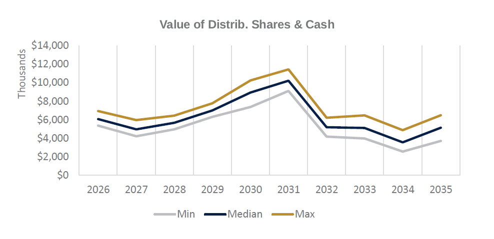
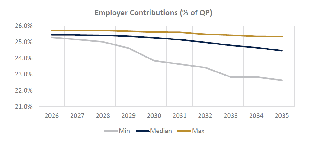
Monte Carlo simulation runs hundreds of projections of when participants may elect diversification, retire, or terminate, and reports the minimum, median, and maximum outcome for each year. Instead of budgeting against one line, the board budgets against a range — and can see which years carry the widest spread. In this example, the obligation in a single peak year varies by more than $2 million on participant behavior alone.
Every one of these regenerates when something changes.
None of these charts requires a new engagement. An annual census update keeps the forecast current, and a new scenario can be run whenever a question arises — before a plan amendment is drafted, before a board votes, or before a lender conversation.
